

You can probably name your top twenty suppliers from memory. Most procurement leads can.
Now try the next question. For each of those suppliers, which country do they depend on for their own critical inputs?
That second question is where nearly everyone stops, and the gap between the two is what supply chain mapping is for. It is also why the exercise gets postponed. It sounds like a project requiring consultants, an analyst, and information your suppliers have no obligation to share.
Some of it does. Most of it does not. A usable first map comes out of purchase orders and spend records you are already sitting on, and it can be built in a week by one person with a spreadsheet.
This article covers what supply chain mapping is, what you can realistically see from a procurement vantage point, and how to build a map that actually gets used. If you want the argument for why geographic exposure deserves a place in sourcing decisions at all, that is a separate piece on why your sourcing scorecard has no field for geography.
What is supply chain mapping?
Supply chain mapping is the process of documenting and visualizing every party, flow, and dependency involved in getting a product or service from raw materials to your end customer. A completed map shows who supplies you, who supplies them, where each party operates, and how goods, information, and money move between them.
The point is not the diagram. It is that a mapped supply network answers questions you cannot otherwise answer: which single points of failure exist, which suppliers share an upstream dependency, which regulatory requirements apply to which flows, and what happens to production if one node fails.
Why is supply chain mapping important?
Because the alternative is discovering your dependencies during a disruption, when your options are limited and your time is short. Supply chain disruptions are no longer rare events.
Between pandemic aftershocks, shipping lane closures, tariff changes, and component shortages, most procurement teams have spent the last few years responding to disruptions they couldn't have anticipated, largely because they couldn't see where their exposure sat.
Mapping does not prevent disruptions. It shortens the time between a disruption happening and you knowing whether it affects you.
The benefits that follow are more practical than the word mapping suggests.
A mapped supply network helps you identify areas of concentrated exposure before they turn into costs, make informed decisions about where to qualify alternatives, model what a supplier failure does to lead times, and build contingency plans against real dependencies.
It can save time in the moment that matters, because the analysis is already done. It also surfaces valuable insights buried in supply chain data nobody has assembled before: for example, four suppliers across three categories quietly depending on the same upstream producer.
The stakes are most visible for manufacturers, since a missing component halts production, but the same logic covers service businesses, distribution operations, and any company whose customers notice when something does not arrive.
A second driver is becoming increasingly important. Regulatory compliance now routinely requires traceability that doesn’t stop at Tier 1. Rules addressing forced labor, modern slavery, conflict minerals, human rights, and environmental due diligence all expect companies to demonstrate where materials originate, not just who invoiced them. A supply chain map is the artifact that answers those questions.
The same map does double duty on sustainability.
Scope 3 emissions reporting, supplier sustainability performance, and social risks in your supply base are all questions about parties you do not employ, in places you do not operate. That kind of transparency is only possible on top of a documented supply network, which is why mapping tends to arrive on the agenda through either risk management or compliance, and then quietly serves both.
The three flows, and which ones you can actually see
A complete map covers three flows. Being honest about how well you can see each one from a procurement system is what separates a useful map from an aspirational one.
Material flow is the movement of raw materials, components, and finished goods through the supply network, including transportation modes, facilities, and distribution points. From procurement records, you see the start of it well: what was ordered, from whom, and when it arrived. You see less between the supplier's dock and yours, and almost nothing after your product leaves.
Information flow is the movement of orders, forecasts, specifications, and status updates. Procurement sees this one best, because most of it passes through your purchase orders, requisitions, and supplier correspondence. If purchasing runs through a system rather than email, it is largely documented already.
Financial flow is the movement of money: payments, terms, credit exposure. Also well captured, since spend data is the most complete data most organizations hold about their suppliers.
So a procurement team can build an excellent map of information and financial flow, a good map of upstream material flow, and a poor map of downstream distribution. That is a vantage point rather than a failure, and knowing its edges keeps you from presenting a partial map as a full supply chain view.
Tiers, and what is genuinely knowable
Supplier tiers describe distance from you within the supply chain network.
- Tier 1 suppliers invoice you directly.
- Tier 2 suppliers supply your Tier 1 suppliers.
- Tier 3 and beyond continue upstream toward raw materials.
Together, they form your company's supply network, and most organizations can see only the first layer clearly.
Here is what is actually knowable at each level, which is the part most guidance glosses over.
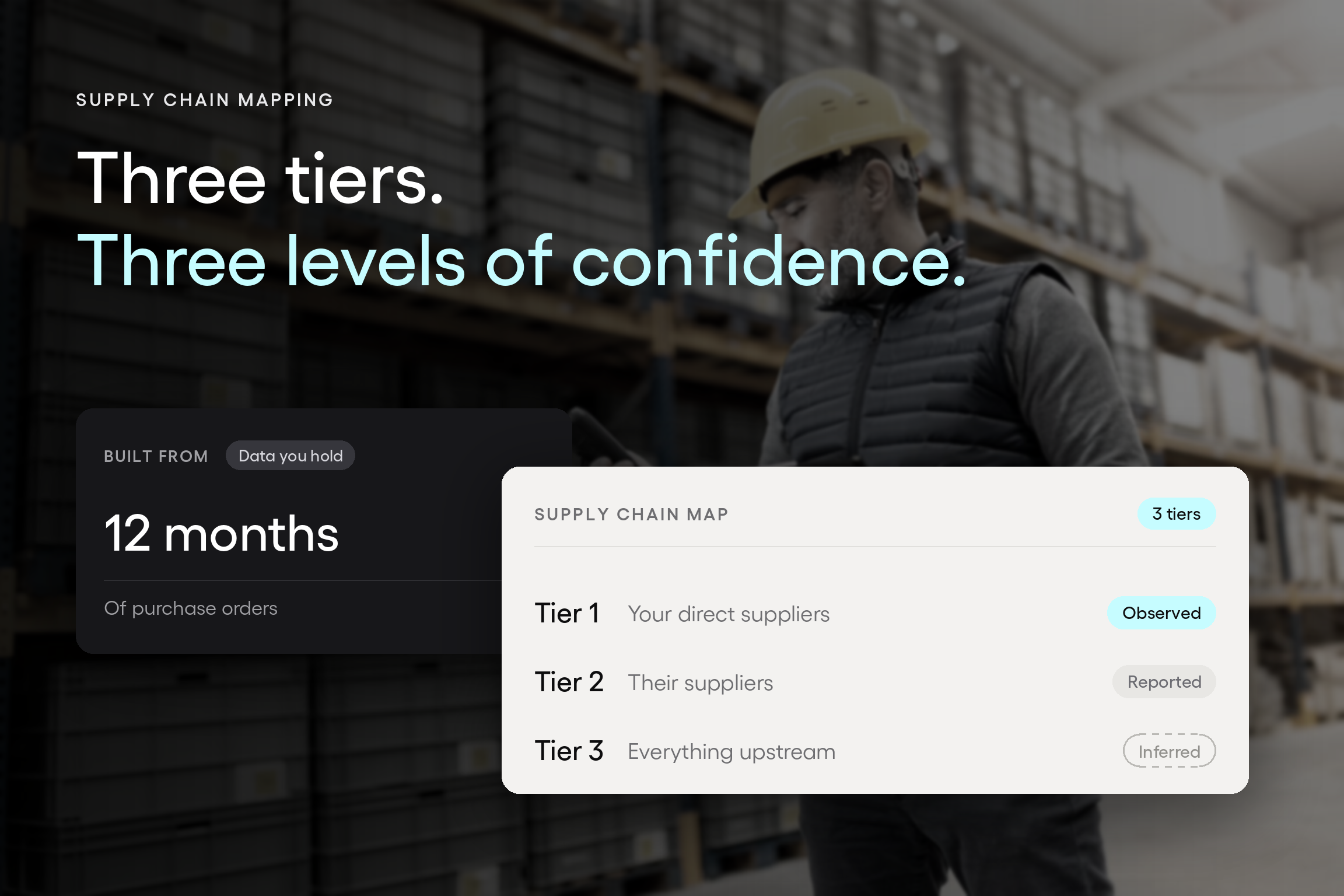
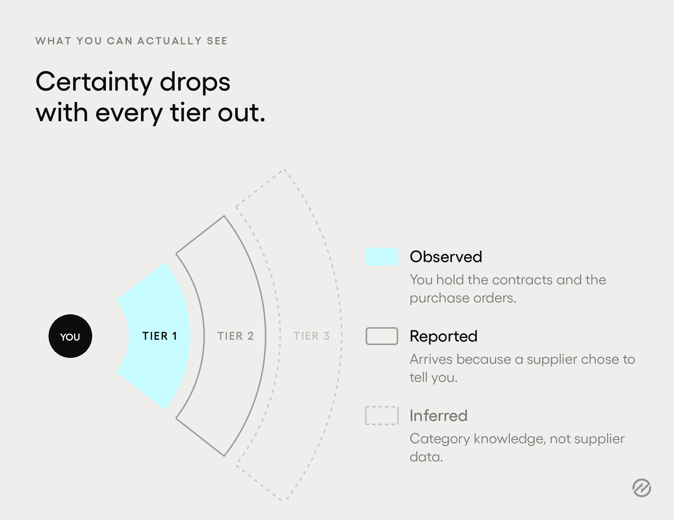
Tier 1 is observed. You hold the contracts and the purchase orders. This data is yours, and it is already in your systems. It is the only tier where you have both complete information and direct leverage.
Tier 2 is asked for, not observed. You have no contractual relationship with your suppliers' suppliers. Everything you know about this tier arrives because a Tier 1 supplier chose to tell you. That makes it self-reported, incomplete, and out of date the moment their sourcing changes.
Tier 3 and beyond are mostly inferred. Below Tier 2, most organizations rely on category knowledge rather than supplier data. You may know that a component category depends on a handful of global producers without knowing which one sits behind your specific part. Sub-tier suppliers are also where concentration tends to hide, because multiple suppliers you treat as independent alternatives can share a single upstream source.
The industry data supports the pattern. McKinsey's Supply Chain Risk Pulse 2025 found that 95% of surveyed organizations have visibility into Tier 1 supplier risks, while only 42% have that visibility at Tier 2 or beyond.
More telling for anyone about to start: of the respondents who had mapped their Tier 2 suppliers, fewer than half reported regular direct contact with them.
That last finding is worth sitting with, because it describes the failure mode of this whole exercise. A map with Tier 2 names on it and no relationship behind those names produces the paperwork of visibility without the substance. You pass the audit and keep the exposure.
The practical conclusion is not to skip deeper tiers but to be explicit about which parts of your map are observed, which are reported, and which are assumed, and to weight your confidence accordingly.
A map drawn to one apparent standard, with no note of where the certainty ends, will mislead whoever reads it in a crisis.
Build the map from data you already have
Most supply chain mapping advice starts by telling you to gather data. For Tier 1, you do not need to. You already have it.
Twelve months of purchase orders and spend records will produce the majority of a Tier 1 map with no new data collection at all. Every purchase order tells you who you bought from, what category it belonged to, how much you spent, and how often. That is four of the columns you need, already populated, already accurate, and already yours.
Start there. The mapping process has three key steps at this stage: assemble what you hold, fill the gaps your own team can answer, and only then ask suppliers anything. The minimum viable map has one row per supplier and these columns:
- Supplier name, deduplicated. The same vendor under three spellings is the first thing to fix.
- Annual spend, from your spend data.
- Category, meaning what you buy from them.
- What it feeds, meaning which product, service, or internal function stops if this supplier stops.
- Alternatives qualified, meaning how many other suppliers could take this over, and how quickly.
- Operating jurisdiction, meaning where they actually produce, not where their head office is registered.
- Known upstream dependency, meaning anything you know about where they source, even if that knowledge is partial.
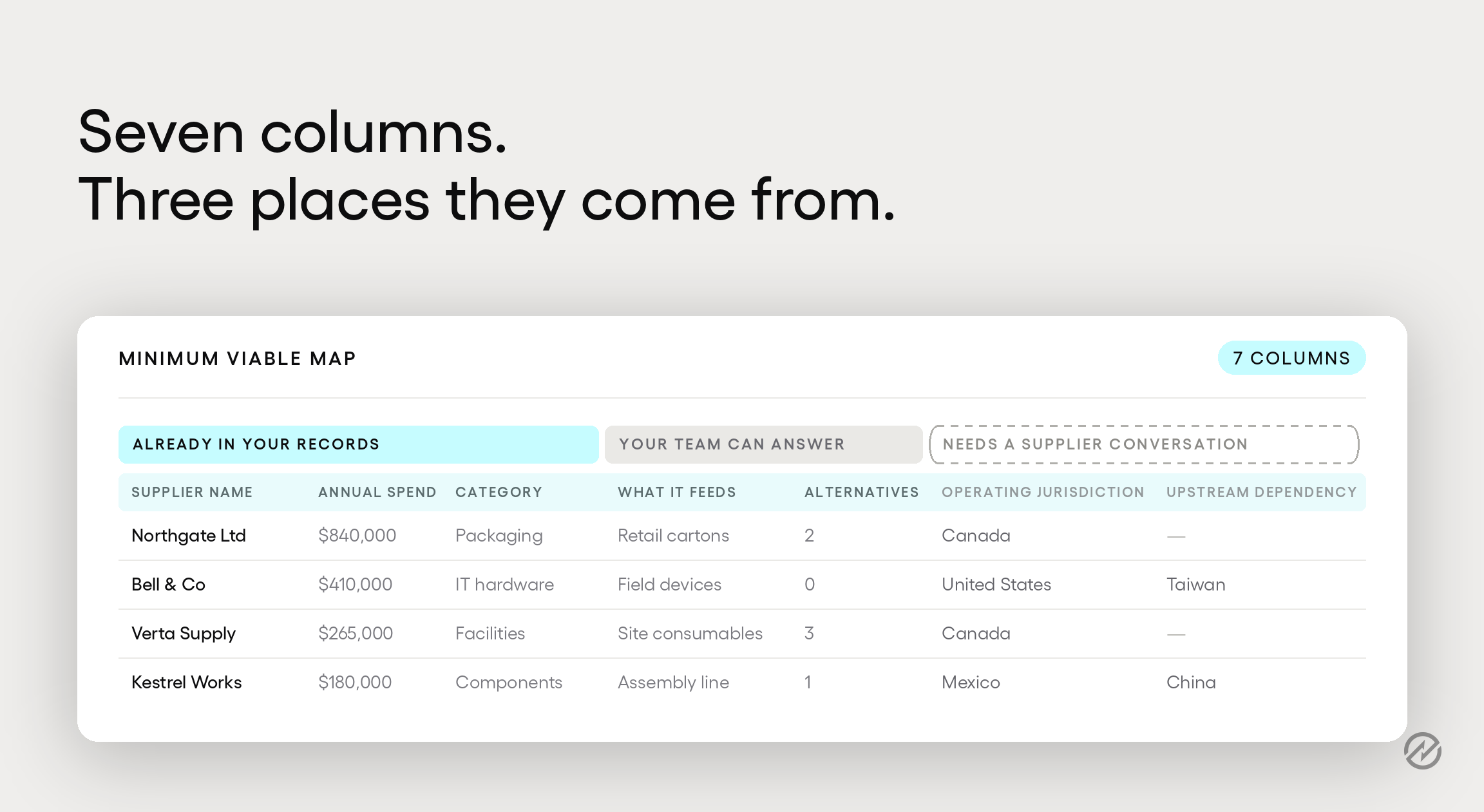
The first three come out of your purchase order records and reporting. The fourth and fifth come from your own team, usually in one conversation per category. The last two are the only ones requiring you to ask suppliers anything.
That distinction turns an intimidating project into a small one. You are not starting from zero and interviewing hundreds of vendors. You are starting mostly complete and filling gaps.
A spreadsheet is a legitimate place to do this. It is where most supply chain maps start and where many usefully stay. What matters is that the supplier data is accurate and that someone owns keeping it that way, not that it lives in a dedicated tool.
Two practical notes.
- Involve people outside procurement: operations knows which inputs have no substitute, finance knows which suppliers carry credit exposure, and quality knows which ones cause problems. Cross-functional input turns a supplier list into a supply chain map, and it usually takes one meeting rather than a working group.
- Do not try to map everything. Deciding where to focus your resources is the difference between a map that gets finished and one that does not. Sort by spend and by criticality, then map the suppliers that matter. A supplier you spend $400 a year with does not need an upstream dependency analysis. Mapping the top fifty properly beats mapping four hundred badly, and the difference in effort is enormous.
What to map against
A map on its own is a list. It becomes useful when you score it against dimensions that reveal risk. Four are worth the effort.
Spend concentration. How much of your total spend sits with how few suppliers. Concentration is not automatically bad, since it is also where your leverage comes from, but it should be a decision rather than an accident. Your procurement reporting already produces this analysis.
Single-source exposure. Which categories have exactly one qualified supplier? This dimension most directly predicts what will hurt during a disruption, and it is the one most organizations underestimate, because a category with three approved suppliers and one that actually gets used is functionally single-sourced.
Category criticality. What stops if this input stops? Rank by consequence rather than by spend, because the two correlate less than people expect. Some of the most disruptive shortages involve cheap, unglamorous components with no substitute.
Jurisdiction. Where your suppliers, and their suppliers, actually operate. This is the dimension that has changed most in the last few years and the one least likely to be on your existing scorecard.
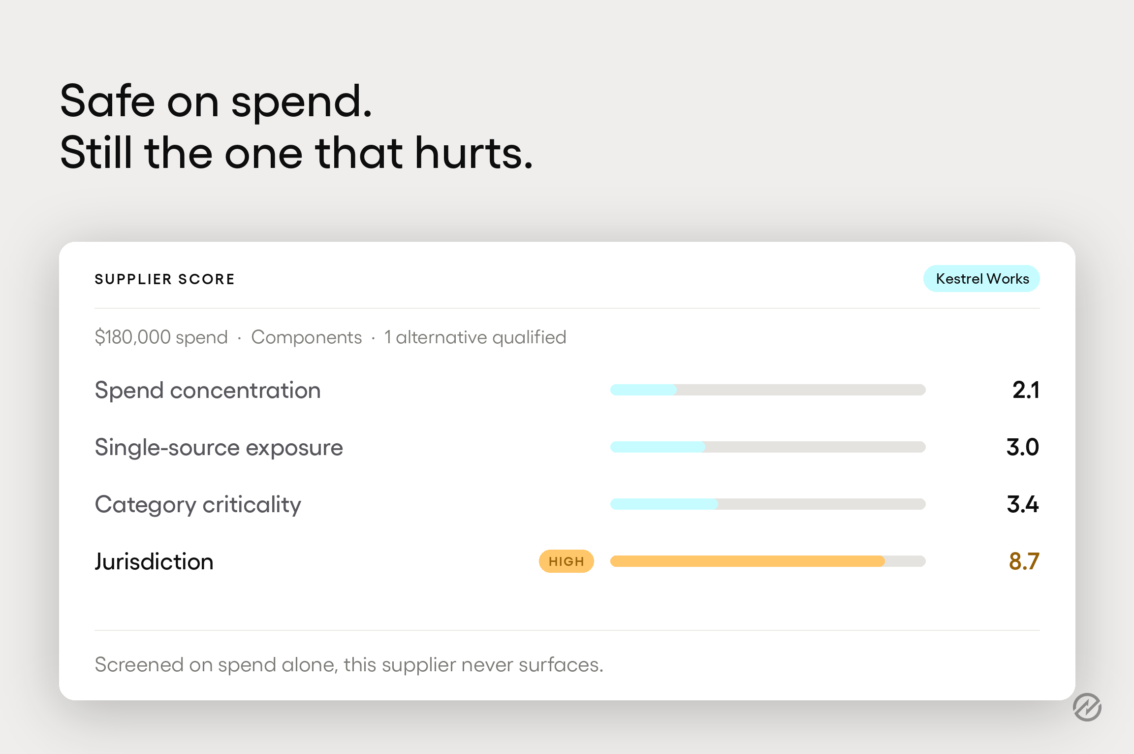
Jurisdiction is commonly misread as distance. A supplier 400 kilometers away across a hardening border and one 3,000 kilometers away inside your own regulatory perimeter carry opposite risk profiles, and a distance field records them as roughly the same.
What you are mapping is whether a shipment crosses a boundary where somebody else's policy can impact it.
The same McKinsey research found that 43% of respondents planned to shift more of their supply chain footprint toward the United States over the following three years, and 38% planned to reduce their presence in China. Whatever your own position, the practical implication is that the jurisdictional makeup of your supply base is changing around you whether or not you are tracking it.
Scored across those four dimensions, the map produces the output you actually wanted: a short list of places where a single failure would hurt most. That list is what lets you mitigate risks deliberately instead of reacting to them, because it names the potential risks across your supplier networks in an order you can act on. It is the input to contingency plans, not a substitute for them.
Where procurement's map ends
Be clear about the boundary of what you have built.
A procurement-side map covers your supply base: who supplies you, what you buy, where they sit, and what you know about their upstream. It is not the entire supply chain end to end, and it is not the entire supply network either. It does not cover in-transit freight visibility, warehouse and distribution operations, last-mile delivery, or customer-side flows. Those require different tooling, usually transportation management and logistics platforms that track shipments in real time.
There is also a category of dedicated supply chain mapping software built for multi-tier discovery, often using external data sources and AI-driven risk analytics to surface supplier relationships you could not find yourself, and presenting the result as an interactive map across global supply chains.
Gartner maintains a supply chain mapping tools market listing for organizations evaluating that category. For a manufacturer tracing conflict minerals to the smelter, that tooling is the right answer, and a procurement system is not a substitute.
Tradogram is not a supply chain mapping tool, and this is not a pitch for one. A procurement platform holds the supplier and spend layer well.
Supplier management keeps vendor records, documents, and qualification data in one place, and spend management produces the concentration analysis. That layer is where most mid-market organizations should start, because it is already yours and it stays current without a separate data-gathering program.
Keep it current, or do not bother
Supply chain mapping is an ongoing process, not a one-time exercise. Built once and filed, a map is worse than useless, because it produces confidence in information that has quietly gone stale.
Treat it as a living document with a cadence:
Monthly or quarterly, refresh spend and supplier data automatically from your purchasing records. If this requires manual work, it will not happen.
Annually, revisit the scoring: single-source exposure, category criticality, and jurisdiction. These change slowly, but they do change.
On trigger, re-map the affected category whenever a major supplier changes ownership, a new tariff or trade measure affects a region you buy from, a supplier reports a disruption, or you qualify a significant new supplier.
The trigger list matters more than the calendar. Most useful updates come from an event rather than a date, and a team that revisits the map only once a year spends eleven months working from a picture that no longer matches reality.
Start with what you can do this week
Export twelve months of purchase orders. Deduplicate the supplier names, sort by spend, and take the top fifty. Add two columns: what stops if this supplier stops, and where they actually operate.
That is a first map. It is incomplete; it says nothing about Tier 2, and it will still tell you more about your exposure than you know today. Everything after it is refinement, which is far easier to justify once something is on the page to refine.